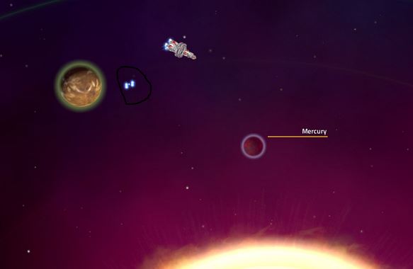
Hi, dumping my first 30 minutes of play (I was slow, gazing at stuff and did get only to Mars w/o landing on it lol). Yep. Despite warnings I had to confirm it the bad way with lives of my crew that Venus and Mercury are an ass 
First impression - all is slick, smooth and cute (highest settings, no Vsync, fullscreen) apart from:
Shipyard UI and dialogue text background
- The colours are dull, a bit annoying and unserious, more like taken from a porn site or something.
- Light blue borders and orange/teal slots look not very nice here imo.
- What's with this micro-grid everywhere? It is quite annoying and also blurs easily if your eyesight is not as good as of 15 year old kid's anymore. The same goes to the dialogue text background grid.
But I bet the UI design here is still under construction (I hope)?
Cargo Manifest
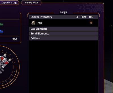
PLEASE! Please correct the headings for cargo. We have all kinds of chemicals in the game, not only elements. And no one says "gas elements" or "solid elements". The better way would be calling them "Gaseous chemicals" and "Solid chemicals". But even better proposal would be "Volatiles" / "Volatile chemicals" / "Volatile materials" / "Volatile resources" and "Solids" / "Solid chemicals" / "Solid materials" / "Solid resources". If it's a sci-fi game, it doesn't mean it's for the 1st grade school education level only.
The dialogues
I agree wholeheartedly with previous orators about the overly exaggerated lightheartedness and silliness of (at least captain's) dialogue lines. I said it before this release and still think alike - the dialogues must become more serious, inventive, witty and occasionally hilarious or brutal - not all the damn time dropping to IQ level 50 jokes and answers. But even that part of the game is not complete, I guess, so maybe it is too early to worry?
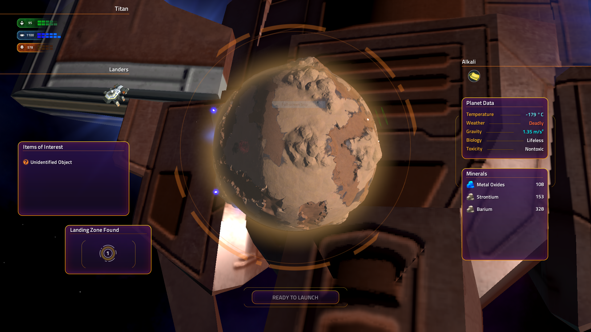
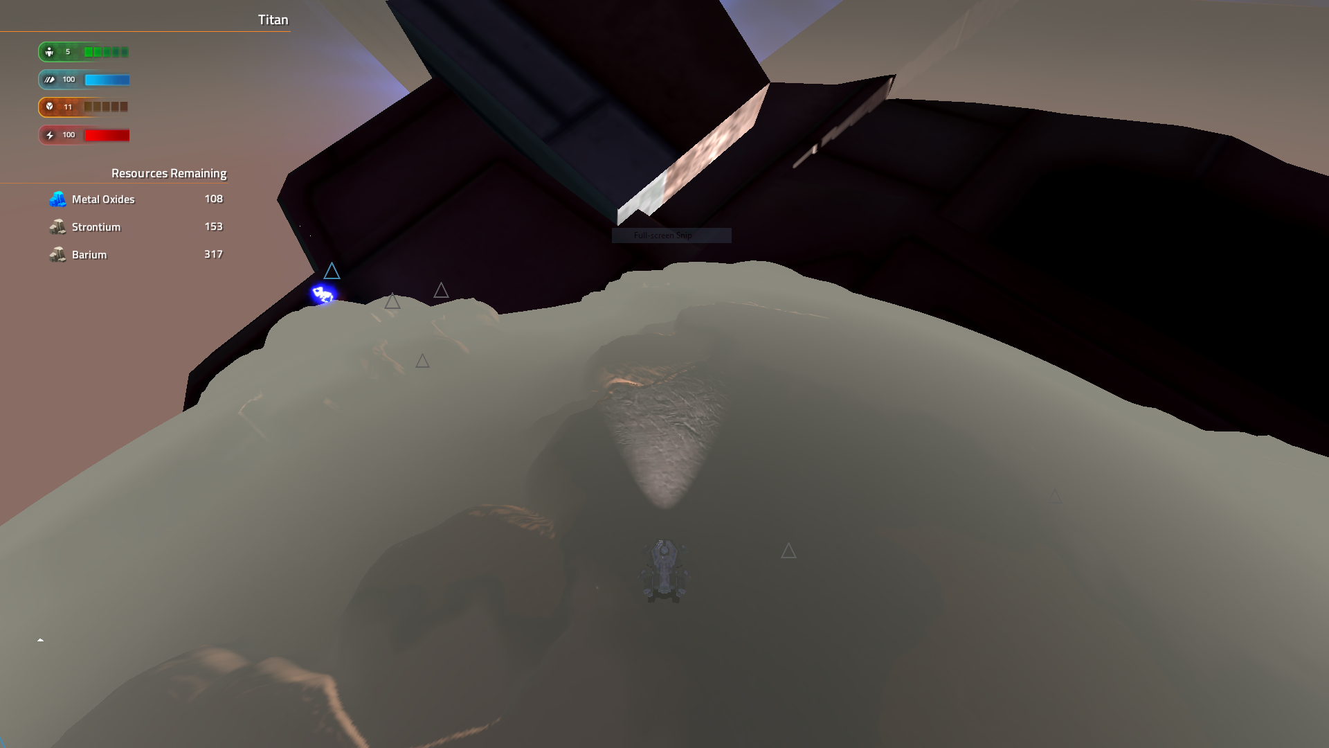
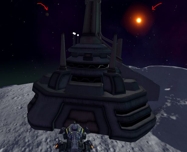
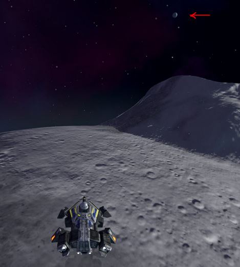
View from planet surface
Planets as such look very finished (and shadows coming huh). Very slick and nice. Mechanics and camera work in this build looks quite fine to me. However the view of space from the surface of moon and I suppose other Sol planets is a bit strange. The sun looks too small and too orange from the surface; the other planets look too large and too close - you are not supposed to see them that easily. I propose to keep the views as is in other planetary systems (auto), but for Solar system - if possible make a custom rule for viewing other planets and Sun from surface. We just know our system too well and it looks too obviously-unrealistic. Most of the game doesn't have to be looking realistic but the solar system imho at least should try to. Distances between the gas giant orbits in Sol are a notch too short as well.
Sun
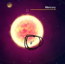
This looks silly - ship hiding and passing thru the sun. I think it was already mentioned before but still. Someone has to come up with a solution perhaps. Bouncing off would be also silly. SC2 had the best solution to this but I guess it's not easy to do in the current engine?
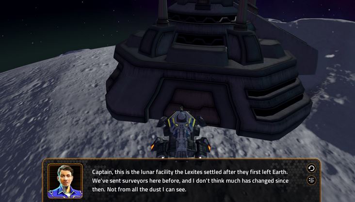
Moon dialogue
When the below dialogue popped up, it briefly interrupted the music/sound for half a second (destroys immersion kinda):
Starbase and Earth
It is a bit confusing that contacting both planet Earth and Starbase leads to the same effect - going to Starbase commander dialogue. I would expect Earth to trigger orbit scan w/o landing of course. Would seem more logical tbh.
Reloading
After reloading from a save, the thruster tracers were left on the screen permanently on initial ship's position. This also occurs in Fleet Battles.
After yet another attempt to load, an empty load menu opened (not sure if it was just by opening the load menu or already after clicking on a save to load, probably the latter). The game would get stuck on that empty menu (still running but stuck) so the process had to be killed to get out of it:
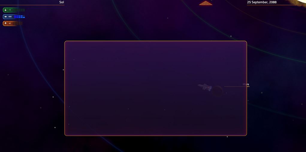
Well, I got to Mars, but not further yet  That's when 30 mins elapsed for me.
That's how the game looked from an unspoiled / objective eye for the first playtime for 30 min.
The version was 0.87.42957 from 04.0618 (Monday's 1st update).


 That's when 30 mins elapsed for me.