It seems you guys subscribe to a different idea of what "cartoony" means than I do. When I use that word, I don't mean "colorful" or "fun". If I were to replace it with one other word, it would be "exaggerated". Yes, the entirety of Star Control 2 (and very little of Star Control 3) is very colorful, but it is very deliberate about how it uses its exaggeration (ie. its cartoony designs). If you will indulge me for a moment, let me analyze SC2's design:
One of the great strengths of SC2 is how it manages to successfully build a universe that holds both Douglas Adams-like comedy and truly deep villains that resonate with the player and makes him or her think. It creates stark contrasts in its approach to storytelling, and it works. Most people attribute this to the writing alone, but the reality is more complex than that. It's a combination of writing, visual design and (to a smaller degree because of the way in which the music was made for this game) the audio design.
SC2 is very particular about where it becomes cartoony and where it doesn't. Notice how the races we consider the most hilarious are also the ones who are the most exaggerated in their visual design. The Pkunk look almost abstract and extremely exaggerated, while the Kohr-Ah are played straight and look like a drawn representation of what could be an actual alien race. Both are colorful 2D drawings, but one is cartoony where the other isn't. Some races mix comedy and seriousness, and their visual representation is also halfway between the two extremes. Take the Thraddash, for example. The Spathi visuals are, in a word, crazy. The Mycon design is subtle in comparison. The VUX are a little bit of both. This is no accident.
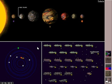
Star Control 2 uses exaggeration to emphasize comedy (or in the case of the biological life on certain planets, exaggerated to make them distinct since there were a scant few pixels to draw them with), but defaults to playing it straight. This is what your average planet looked like in that game:

There's nothing cartoony about it. It's played straight, with a simple simulation using real-world physical values to make it believable. There are no exceptions to this when it comes to planets in the game, not even for Rainbow worlds. The reason is simple: The planets aren't used as comedy.
This however, is cartoony exaggeration for comedic effect:

While this is not:

In my opinion, claiming that Star Control 2's design was overall cartoony reveals a fundamental misunderstanding of what that game was trying to accomplish with its visual, audible and written atmosphere. That Stardock's team is going all-out cartoony for planets is surprising and a little bit disturbing.
Yet on the other hand, other parts of the design seems to reveal that the team might understand these distinctions after all. Take the contrast between the visual design of the alien race that has been made public (a cartoony design that implies that this race will be played, at least to some degree, for comedic effect) and the scrapped humanoid alien design from the Founder's package (a more serious design that implies that such a race would have been played straight, with little humor). If Stardock manages this contrast in their alien encounters, why are they suddenly also going for the comedic style for planets. Is planetary exploration supposed to be laugh-out-loud funny this time around? If it is, then my arguments fall flat and I will withdraw my criticism of the planets' visual design. Otherwise, I'm not really sure what Stardock is trying to accomplish here.
I know this isn't the fun kind of feedback, especially since visual design typically gets locked down pretty early on in the process, but I would be remiss in not speaking out about something I felt strongly about the moment I saw the concept art. Atmosphere and design is near and dear to me. Listen to my Arilou remix ("Welcome to Falayalaralfali") for example. I deliberately exaggerated the mood in that piece to make it seem too relaxing, as if the Arilou were trying too hard to make you comfortable, hopefully making the player feel vaguely uncomfortable instead. The remix isn't relaxing and soothing by accident. Good design doesn't come about by accident, and as mentioned, Star Control 2 seems very deliberate in how it handles its own design in a way that I'm not recognizing in the planetary concept art for this new game.
That's what I mean when I saw that the planets appear too cartoony, and that's why I'm worried enough to post a thread about it.